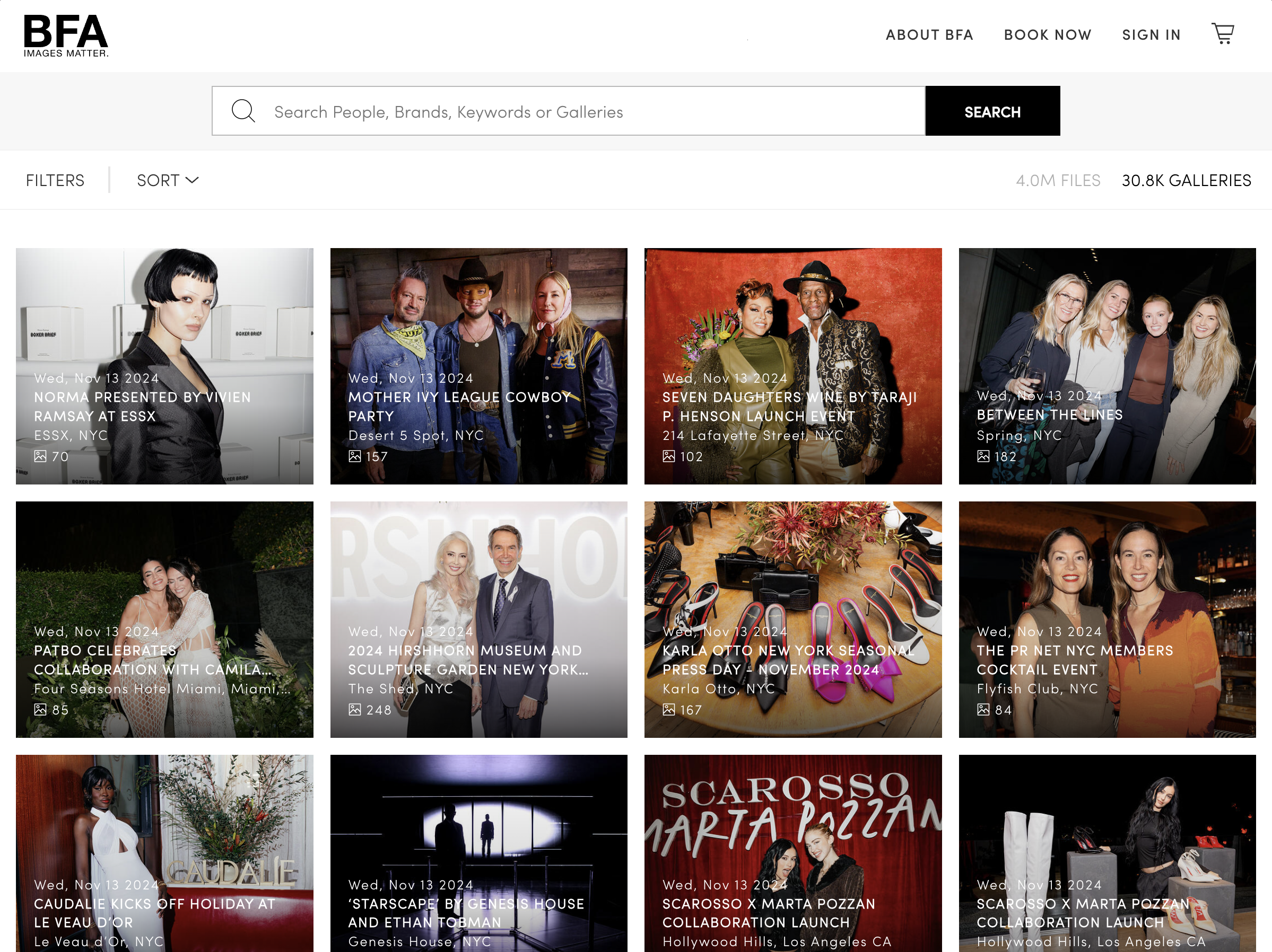
Services: UI/UX Design, Responsive Web Design, Front End Development, UI Toolkit
Key Takeaways
- Improved usability of a heavy traffic site for all stakeholders
- Engineering reusable components to scale across digital properties
- Crafted a distinct design language and cleaned up UI for market differentiation
BFA is one of the largest boutique, event-focused photography agencies in the world. You’ve most likely come across their sanctioned photos on news sites, social media, and published formats for many, many years. Ambitious and adventurous, BFA has been committed to interrogating their digital identity and UX, and improving their digital footprint and workflow for all stakeholders: casual viewers of photography aggregation sites, media agencies, subjects of photography, and the photographers themselves. As such, the company is situated in a complex space of b2b and consumer interaction, representing a particularly challenging set of design problems.
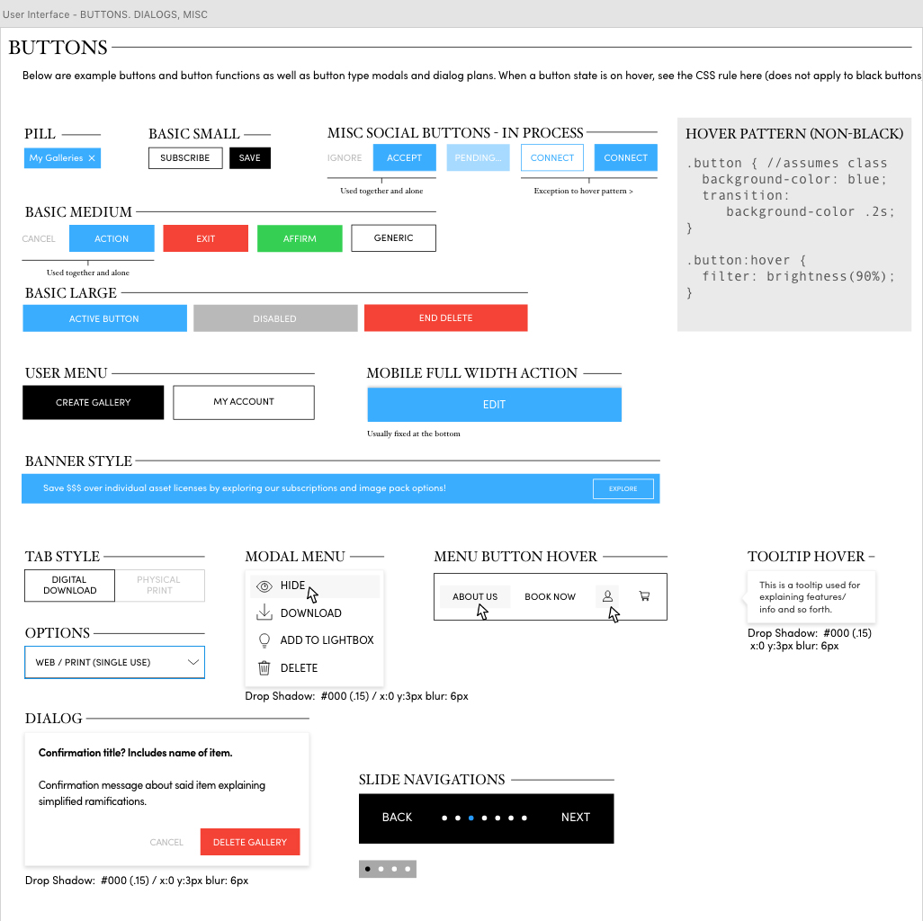
The various needs of their clients and customers present certain user problems that require elegant solutions. First and foremost, we decided on the necessity and importance of a pattern library to test our various UX/UI decisions. Working within Adobe XD then Figma, I created a grab and go library of consistent assets that could quickly be used to create modals, logins, menus and more. This was a new process and resource for the developers, shockingly. Here is an example of one UI sheet. For more scroll to the end.
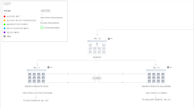
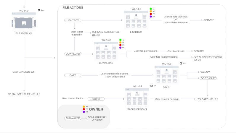
Next, we built out some U/X necessities for some of the new modules we were creating. For this I used traditional sitemaps to show how current information and data maps into these new modules. I also used some priority maps for specific features.
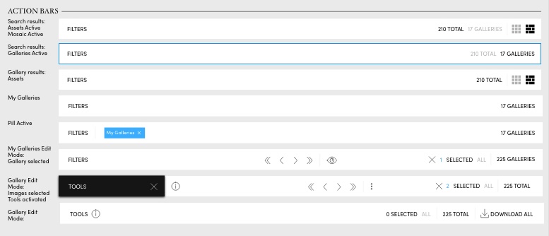
One of the more interesting challenges of this design phase centered around the informational power embedded in the BFA action/search bar. The action/search bar serves as an indicator of what is on screen below the bar itself. It also signifies what filters, views, selection info and controls are available at any given time to consumers and businesses. Figuring out how to do this elegantly without overcrowding or creating confusion was the inherent risk in making the action bar as powerful as it is.

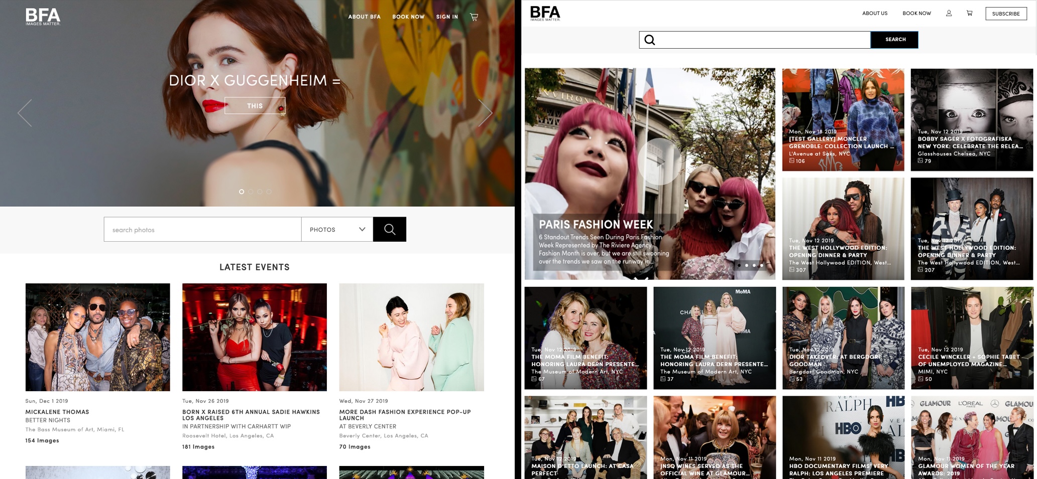
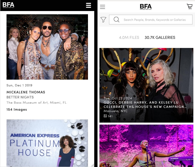
Finally, we focused on a digital refresh of their current site and future properties. We wanted to pack in more visual enjoyment for the user while maintaining a strict gridded system. By shrinking the breathing room, we create more of a gallery focused experience with added contrast, gravitas and user consideration.
Old on the left, Refresh on the right!

Technologies: Adobe XD, Figma, HTML, CSS, Javascript, React