Reuters
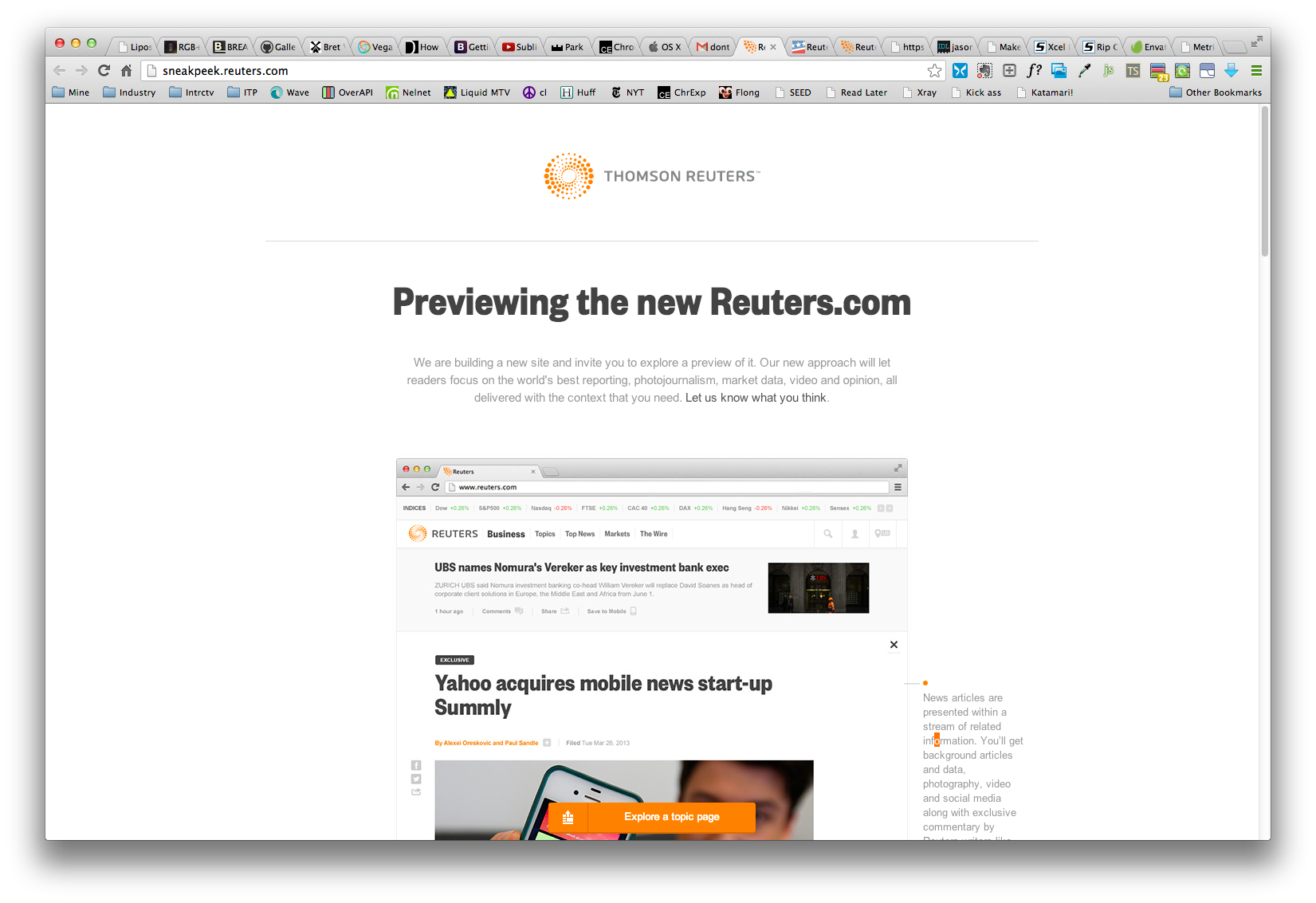
Thomson Reuters sought to educate and prep their existing online readership for their unveiling of their new digital and mobile properties. Of course, the challenge lay in creating an easy, peppy, minimal tutorial for a population that skews older and less navigationally savvy.
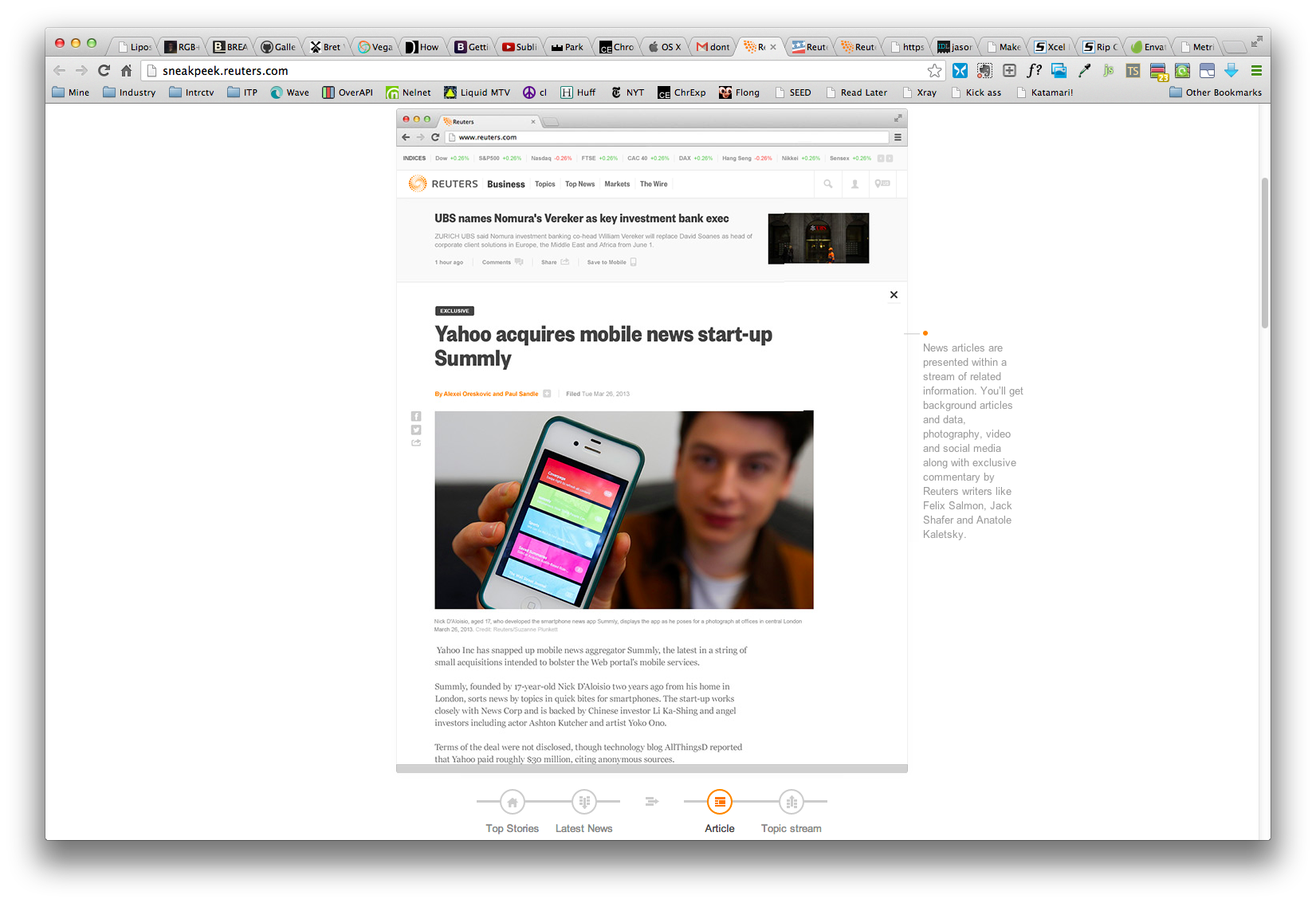
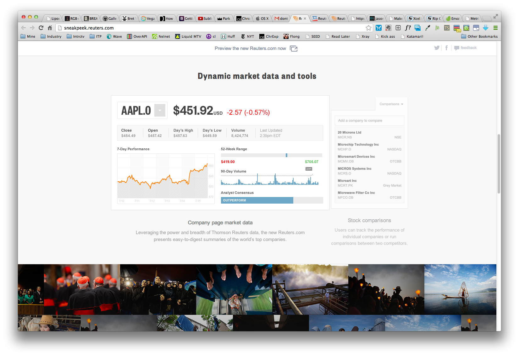
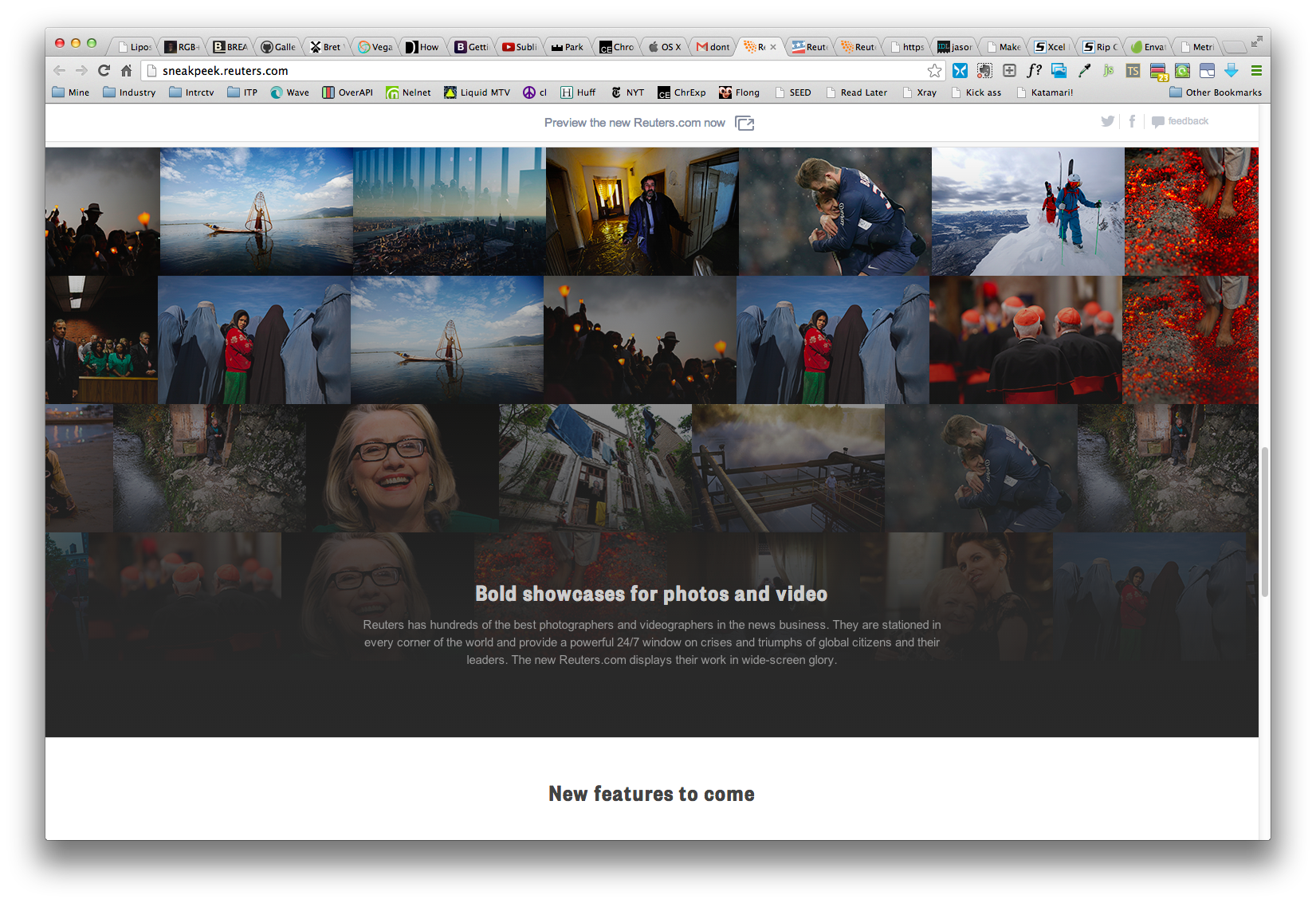
The result was a smartly designed and interactive "sneak peek" into what was to come with the new Thomson Reuters' reuters.com website.
Focus was placed on displaying information as simply and cogently as possible, walking the user through the impending changes in an unobtrusive and digestible way, after all, the the "river-of-news" type of approach of information display- mirroring the flow of data on one of Reuters terminals-, was quite a departure from previous site iterations. This design choice brings news into a modern feeds method of showing articles popularized by social media.


